I’ve only gone and done it! I’ve only gone and got myself a proper logo!
Getting to this point has been hard work. I am not a branding expert. I’ve been trying to self-teach, because:
A) I can’t afford to hire a branding expert right now and
B) I’m a curious kind of person and I enjoy giving things a go and learning. I feel I can practice and test-run things with my own brand/business.
One thing I do know is that branding experts are always saying “a brand isn’t just about getting a pretty logo.”
I totally dig that. I’ve learned that lesson and agree with it. To get to the point where I think a logo is relevant, and I won’t stuff it up, I’ve had to do a lot of searching into my professional business soul. Going in logo-first without understanding the direction, aim and target audience of your business is a fast route to spaffing money up the wall.
I’ve spent many hours researching, defining, writing, refining, re-researching, and rewriting my own brand messaging and strategy. Extracting it all from my brain and putting it on to paper has been hard. I’m probably not even totally done, but I am at a point where I “get Rose Crompton” and am ready to start communicating that in a visual way so potential clients “get it” too.
The very wonderful Zava Design won the gig to help me visually encapsulate everything that professional Rose Crompton is.
The finished article.

Looks great, but what does the Rose Crompton logo mean?
Glad you asked.
It does the obvious: tells you my name and what I do. But if you’re looking for deeper insight about why I chose particular colours and shapes here’s the navel-gazing, critical analysis version:
Purple: Features heavily, because it’s my favourite colour. No other reason.
All the other colours: I wanted something bright, different and a bit daring. I wanted my logo to show that I’m upbeat, vibrant, and fun to collaborate with. My ideal clients will vibe with that, because they feel the same about their businesses.
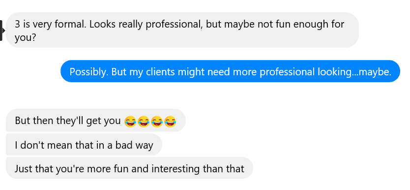
Also, as one of my good friends pointed out when I showed her the initial concepts and the one I was leaning towards:

Fair comment.
Letters in different fonts and sizes: at first I was a little worried this looked a bit too informal. Then I reasoned it was a nice way to sum up my creativity, which comes in different forms and shapes depending on what the client needs from me.
Circles and ‘C’: content, copy, Crompton — they are all great ‘C’ words. Besides that, I knew I wanted to use my initials and name in the logo, so Zava Designs worked that in by encircling the more vibrant ‘Rose’ using the ‘C’ of my surname.
Within the context of my logo, it’s a visual representation of my neater, more professional side.
While it’s important for me to be vibrant and creative in my job, I also need to be professional and organised. Big projects can mean spinning a lot of plates all at ones. Working with several clients simultaneously, means having my house in order. It’s the only way to keep everything running smoothly in terms of meeting deadlines, being mindful of budget, collating feedback and writing reports.
I like how the ‘C’ and circular shape reflects the more serious side. It’s neat. It’s tidy. It solid.
Like this design and need a logo of your own?
I worked with Sydney-based designer, Zava Design. Check them out. David was great to work with — quick, responsive, patient, creative, expert.
Don’t need a designer, but do need a copywriter?
If you like the look of my logo (and hopefully the sound of my blog) then how about we set up a no-obligation call?
You can contact me, or take a look at the services I offer.


0 Comments